Creative Direction
Projects
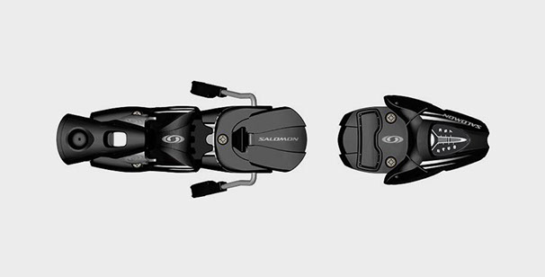
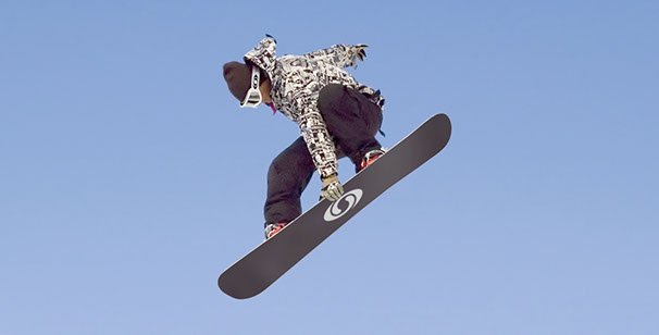
Salomon
Overview
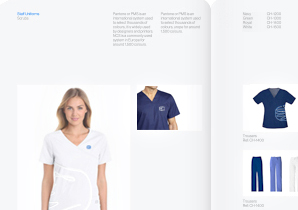
Salomon are renowned for building quality products for extreme sports. An identity
and design language was required for
their inaugural snowboard range which
had been developed over several years.
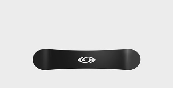
The ‘spirale’ logo was created to symbolise motion and freedom of the sport. One of
the logo principles is that when placed on
the base of a snowboard it should maintain optimum visual exposure, regardless
of direction or angle it is viewed from.
The first board range featured a series
of single-colour topsheets to emphasize product purity. It was this visual statement
of honesty that helped gain the product respect from a new customer base.
It was an effective juxtaposition against
the visual noise of snowboard sub-culture.
The popularity of the‘spirale’ logo was
so well received by both company and customers alike that it was adopted as
the main Salomon brand logo. Subsequent sub-brands, advertising and retail design guidelines projects followed for inline
skates, hiking and snowblades.
Designed with Neville Brody
Identity

Application
Inaugural snowboard range


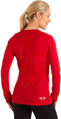
Apparel
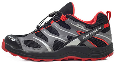
Ski bindings